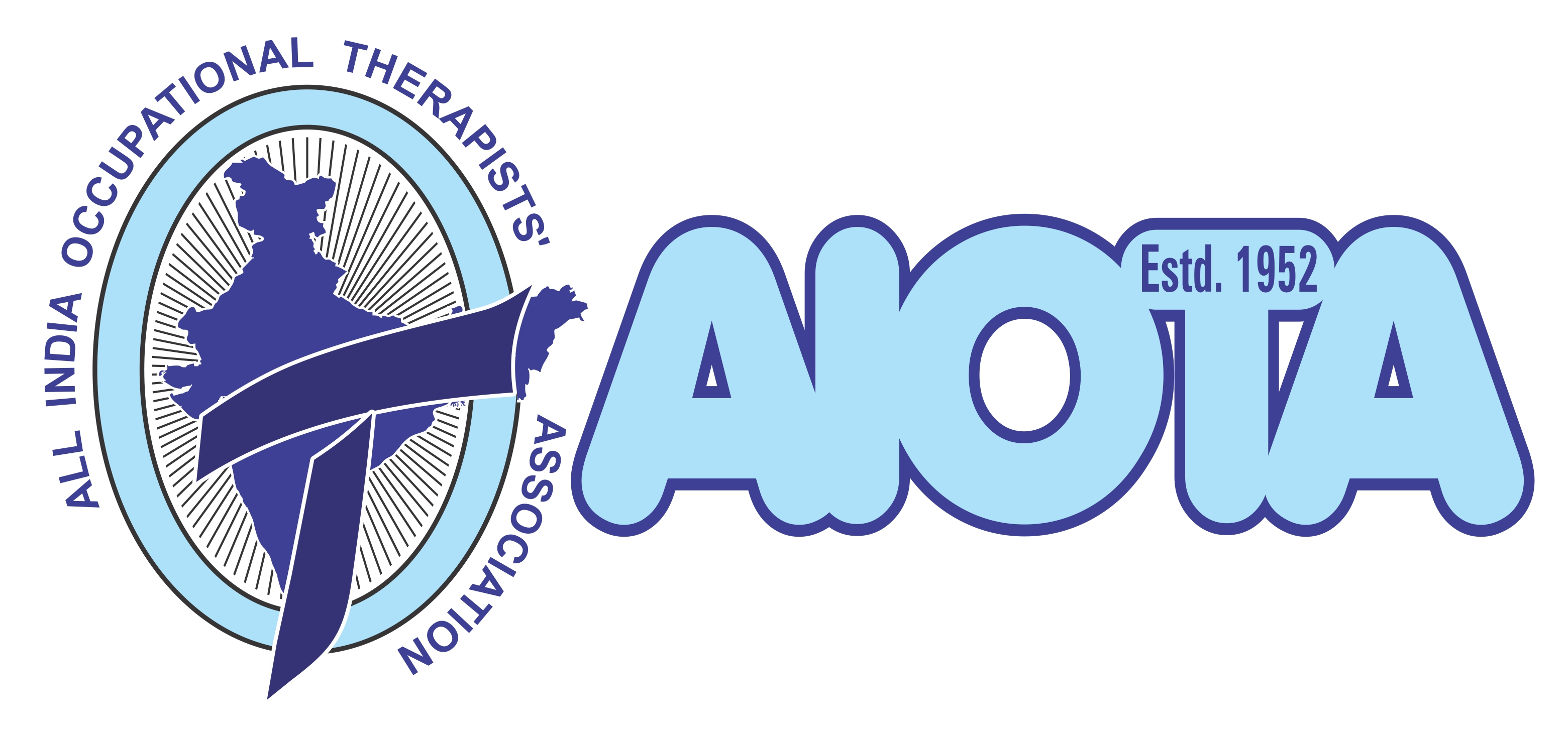
AIOTA logo is suggestive of community, friendship, love, relationships, care and unity in practice of occupational therapy, which is an integral part of health care system of India.
The Rays represent signs of hope, radiant-energy and enthusiasm amongst occupational therapy professionals to promote their important and valuable role in a healthcare team of professionals, for client's preventive health care, safety and wellbeing; pre-habilitation, rehabilitation and ongoing research to improvise on quality of care. It also represents a ray of hope amongst occupational therapists towards multidimensional growth of the profession in India.
The Color Black (of Double Lined Alphabet ‘O’ [which stands for the word ‘Occupational’] and of the Rays outside the Map of India) represents class, elegance, formality, power, sophistication, and wealth. Black combined with other colors has a very strong impact in conveying the intended message. Black colour is used to absorb negative energies. From an Indian cultural perspective, black colour has traditionally been used to protect oneself from harm and negativity. Thereby, the black rays in "O" of the logo symbolizes the inherent nature of occupational therapy profession, which symbolizes to reduce all negativity from the life of a person with impairment, protect him/her from foreseen potential harms due to his/her impairments, and finally provide a new lease of life filled with power, elegance and full of positivity.
Map of India: Reflects Occupational Therapy profession dedicated to render their expertise in promoting health and wellbeing of the people of India, with varied impairments, dysfunctions and disabilities.
Outside of the outer circle of ‘O’ is the name of the national professional organization of occupational therapy in India, which is named “All India Occupational Therapists’ Association”. The association is responsible for the growth and advancement of the healthcare profession of Occupational Therapy in India.
The Color Blue (of Double Lined Alphabet ‘T’ [which stands for the word ‘Therapy’] and of the Map of India) represents cleanliness, confidence, harmony, immortality, peace, protection, security, stability, technology, truth, and unity. Blue is a calm and cool color, which reflects creativity and intellectual skills in therapeutic assessment, goal setting as well as execution of treatment plan. It is a color that symbolizes loyalty towards clients, strength in handling an adverse situation, trust gained from clients for the services delivered and wisdom in conveying the truth about the illness to the clients.
The Color White (The Transparent or White Color Background) represents cleanliness, goodness, humility, innocence, peace, precision, reverence, and youthful zeal in practicing the profession of Occupational Therapy. White is often associated with being fresh and pure. The color white is reflective of, and stimulates creativity, growth and openness in expression of ideas.
Abbreviation AIOTA next to the Logo is the standard acronym used for the professional body “All India Occupational Therapists’ Association” and it states that it was established in 1952.
© 2018 AIOTA. All rights reserved.